Where do you usually send your visitors immediately after they’ve completed a certain task on your blog/landing page?
Where do they go after they’ve completed a sign-up form or after they’ve purchased a product from you?
That next page is very important and will determine whether or not you’re leaving money on the table.
- That next page is your Thank You page.
You know that page which takes you a few seconds to put together? That’s the one I’m talking about.
Your Thank You page is one of the most vital pages on your website and should be treated as such. A good Thank You page provides an opportunity to build on the trust and engagement level of the customer at that particular point in their decision-making journey.
Apart from that, it also gives you the perfect chance to buttress that they’ve made the right decision by giving you their email address/purchasing your product. This way they won’t be confused and wondering, “What next?”
However, as conversion-oriented marketers, we’re often more focused on persuading visitors to take action upon arriving at our landing pages. Once that happens, most people just thank them and simply walk away happy that they’ve landed a conversion.
I must say:
- This is an expensive mistake.
For goodness sake, you just did a good job by convincing these people to take your desired action; they’re now hot prospects and ready to do whatever you ask of them!
By sending them to the boring page that says “Thanks for signing up, bla…..bla…..bla”, you’re giving them a free gate pass to go away and forget about you.
Is that what you want? Why not take advantage of the momentum you’ve just built and engage them more?
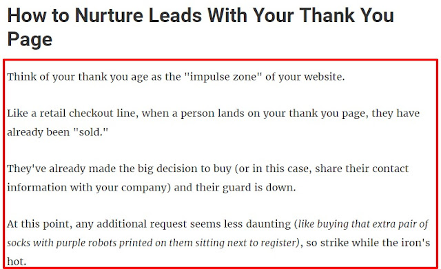
In this blog post, the guys at Impactbdn say it all. Check out the screenshot below:
If all you do after a prospect performs any task on your blog is thank them and walk away smiling, you’re committing a big crime that might eventually catch up with you.
What if you could gain more from these people by sending them to a highly optimized Thank You page?
What if they could:
- Give you more money
- Tell you exactly what they want from you
- Send your offer to their friends
- Share your offer on their social media channels
Wouldn’t that be awesome?
-I know your answer is yes.
The good news is that you can achieve all of these things via your Thank You page.
When used properly, Thank You pages increase 3 things:
- Exposure
- Authority
- Revenue
In this post, I will share with you some cool and easy to implement tips which you can use today to optimize your Thank You page in order to boost your ROI.
So let’s quickly get to it.
7 Powerful Ways To Optimize Your Thank You Page
1. Show Appreciation
One of the first things I was taught as a kid was the act of saying “thank you”.If someone does me a favor or gives me a gift, “thank you” is the next thing that comes out of my mouth.
According to Ramona Sukhraj, saying “thank you” is just good manners 101 and I couldn’t agree more.
By thanking your customer, they will feel special and appreciated which will further enhance their decision to stick around because they know they’re welcomed.
2. Give Them What They’ve Opted For
After you’ve thanked your new prospect, the next thing to do is to show them how to get the offer you promised.
They now feel welcomed and know they’re in the right place. Don’t let them get confused and start looking around trying to figure out how to download your offer.
I’ve come to some Thank You pages before that were very difficult for me to figure out where to get the information I opted in for.
What usually happens in this case is that the prospect will just leave the page out of frustration and will never return again. (I’ve done this several times). It creates a very bad first impression.
Give them a bold, obvious link or download button for them to click on.
Don’t make them hunt around.
Check out this Thank You page example:
As you can see, they first thanked the prospect and then displayed an obvious button to get the freebie they promised.
Notice that they also included the name of the eBook on the page. This will enable the prospect to know that they are indeed in the right place.
3. Add A Survey
Surveys are the easiest, fastest, and most inexpensive way to get feedback from your audience.
And after they’ve signed up/bought your product, now is a great time to get valuable information about your targeted audience. This will help you serve them better down the line.
- According to a research study carried out by the Journal of Business Research (2011), surveying your customers shortly after their purchase can result in more positive product evaluations.
Therefore, consider integrating a simple customer survey into your Thank You page.
This isn’t difficult; you can easily use Google Forms to create one and link to it.
Similarly, you might decide to do it the way Master of Malt did theirs:
As you can see, they’ve embedded their own survey directly onto their Thank You page. This will ensure their readers don’t have to click out of the page before filling out the form (which will increase conversion rates).
One important thing to remember:
- When creating your survey, keep it short. (You can also let them know how long it will take to fill out the form.)
Google Forms is free and easy to use, so go create your own form now.
4. Add Links to Your Best Blog Posts
This is a no-brainer.
Linking to some of your best content on your Thank You page will convert the page into a superb resource page.
This will also strengthen your reader’s perception of you as an expert in your niche.
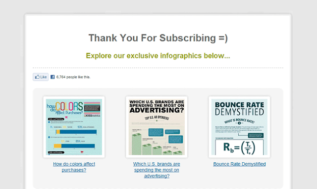
Check out this screenshot from HubSpot:
And this one from KISSmetrics:
5. Use Social Proof and Testimonials
In this post (and in upcoming posts), I will be mentioning social proof a lot.
It’s important for you to understand what social proof is and why it’s important.
In the case of Thank You pages and increasing ROI, testimonials will work really, really well.
One of the easiest ways to boost your conversion rate is by showing your prospects that other people are already saying good things about you and your products.
When you back up your claims with solid social proof, people will trust you more.
Here’s what Social Triggers did on his Thank You page:
Derek displayed the amount of people that have “liked” his page (with their pictures). Then, there is a Facebook comment box at the bottom of the page for people to discuss the eBook.
He also included clear instructions of what his audience should do.
This leads us to…
6. Include a Call-To-Action
When optimizing your Thank You page, it is very necessary to have a clear call-to-action to suggest other ways in which readers can make a deeper connection with your brand.
Examples of good calls-to-action:
- Subscribe to Our Blog
- Follow Us on Twitter
- Sign Up for Our Free 30-Day Trial
7. Make It Social
This is very important.
Your visitor has just engaged with your product which means they’re now more likely to share the good news with their friends.
- Remember: Google now places more weight on social sharing; one of your goals should be to have as many people as possible share your site.
Most people often assume their readers will willingly share their content once they see the social sharing widget on their sidebar.
This is not true. You have to bluntly ask them to do that.
While on your Thank You page, they’re still in the mood to take your advice. Take advantage of this and advise them to share your content.
Conclusion
Naturally, you want to keep your blog visitors receptive and engaged.
It doesn’t matter what business or niche you’re in. Implementing a few of these simple tips mentioned here will greatly boost the ROI of your Thank You pages.
If you want:
- Repeat business
- Better customer relationships
- Boosted potential average order values
- Boosted brand reach in the social sphere
- Increased word of mouth about your brand
Give your Thank You page some love and enjoy the benefits.
I would love to know what you think about these tips. Do you have any of the above in your Thank You page? How has your ROI changed after implementing these strategies? Let me know in the comments!
Source.....shoutmeloud


Good enough is a far cry for very good, even though both are "good" in a sense. Excellence is when you give your best to everything you do. This excellence is not optional if you want to be a successful Internet marketer. SEO Antwerpen
ReplyDeleteExcess electricity can be stored for use on days that are overcast. The ability to store excess electricity in batteries means you don't need to be attached to the grid even for cloudy days. www.zonnepanelen-soloya.nl/service/zonnepanelen-kopen
ReplyDeleteFitting photovoltaic (solar) panels while continuing to be connected to the grid is the most common method of changing to solar power. Any added electricity generated by the solar system is then fed into the grid. In this way the household can get paid for additional electricity produced, and can also acquire electricity at night. www.zonnepanelen-soloya.nl/beste-zonnepanelen-merken
ReplyDeleteEaseUS Data Recovery Wizard Crack the best facts restoration software to get better deleted, formatted
ReplyDeleteFine Crack
easeus data recovery crack/
football-manager-crack-for-macos
Plagiarism Checker X 7.0.5 Crack Excellent accurate spelling and sentence placement.
ReplyDeleteFine Crack
plagiarism-checker-x-crack-mac
dxo-photolab-crack-mac
From the above statistics, it is evident that the size of an organization played a role in the determination of the amount of returns received. It beats logic for one to expect a large organization to receive low amounts of returns and vice versa. SEO
ReplyDeleteHot water is generated by directing water between the solar panels, heating it up as it goes, after which it is channeled into the water system and of course, comes out of the faucets as hot water. Zonnepanelen plaatsen
ReplyDeleteDMG files are Mac OS X disk images, but you can open them on Windows with vst4free.
ReplyDelete